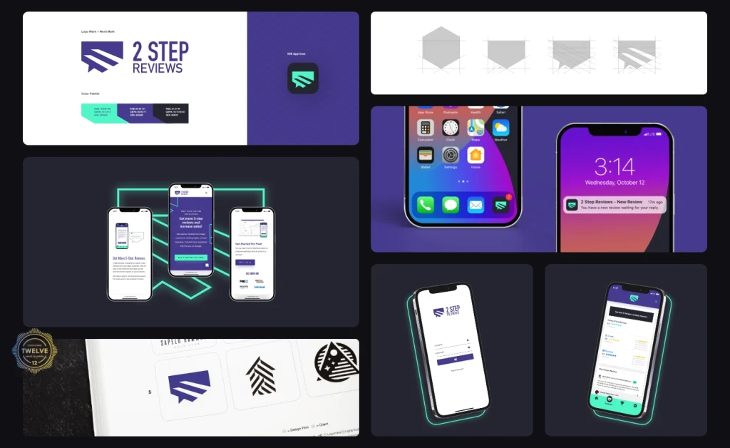
Nonprofit | Duncan, OK
Crafting a warm and encouraging nonprofit brand identity that uplifts spirits and provides comfort to women undergoing cancer treatment.
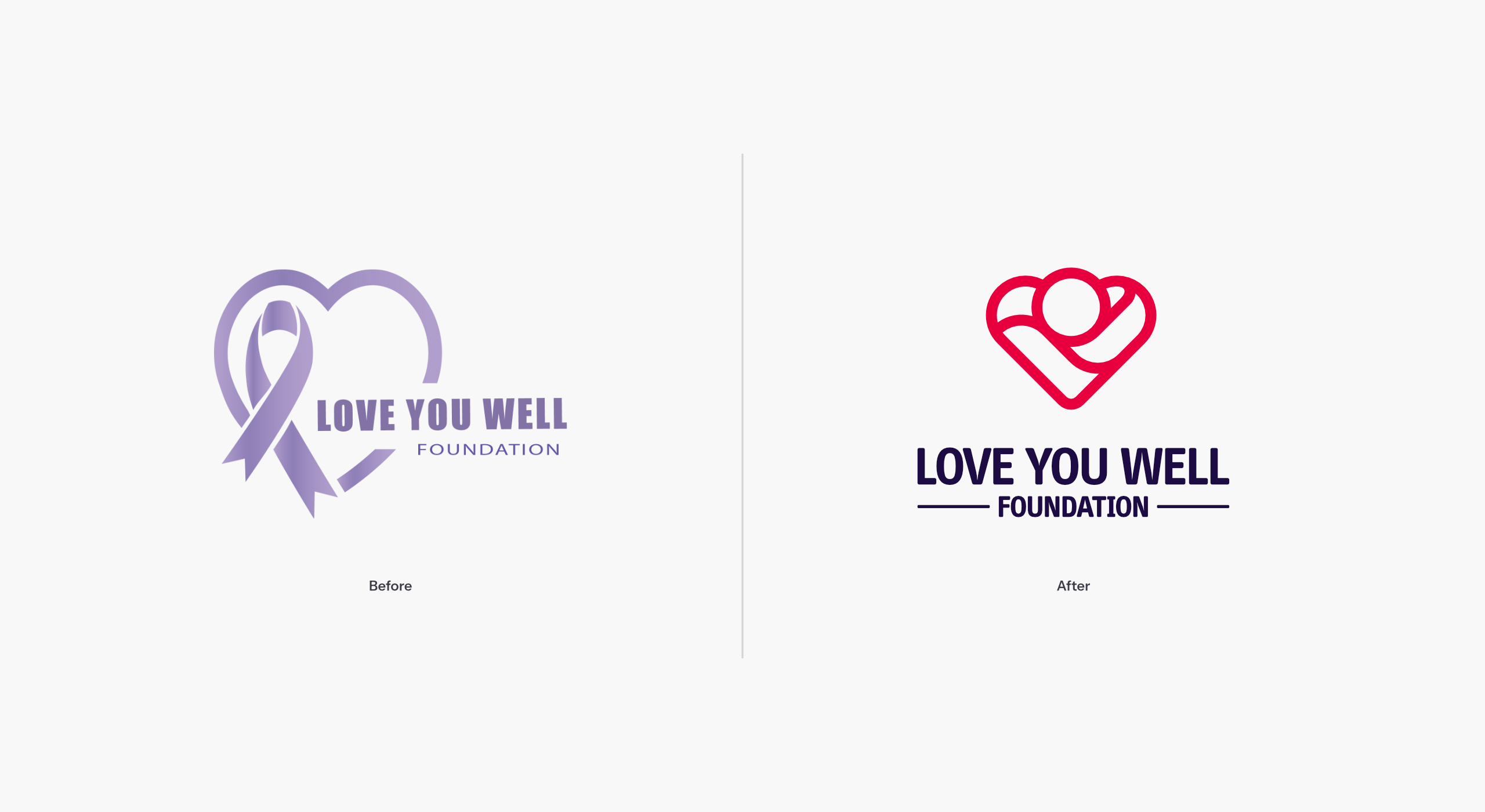
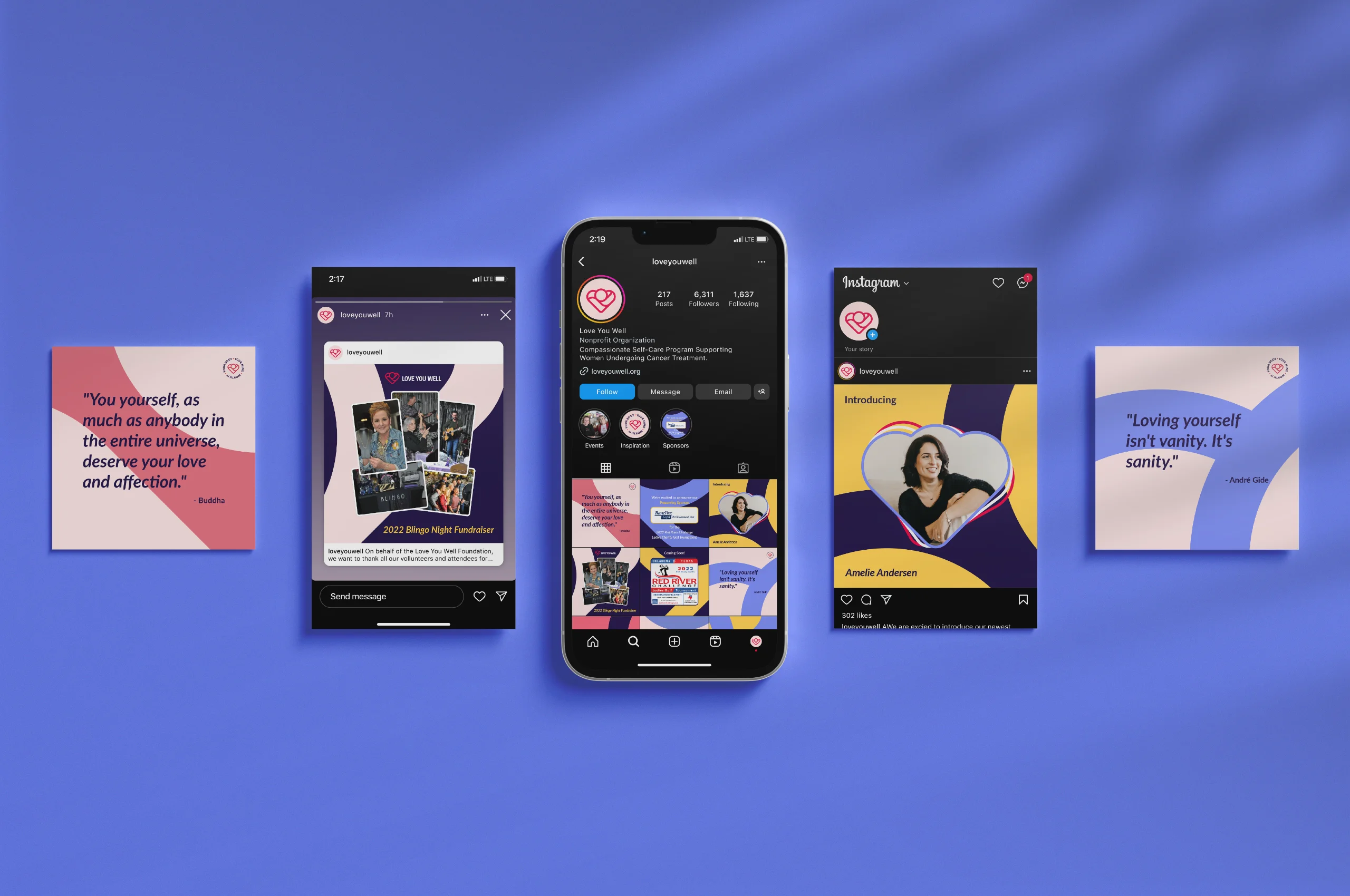
The Love You Well Foundation is a nonprofit providing compassionate self-care programs to support women undergoing cancer treatment. The foundation provides care kits, hosts various fundraising events, and promotes awareness of the significant role self-care plays in personal healthcare.
As the foundation expanded its reach, the founders recognized the need to replace the initial logo that had been used to get the project off the ground. The nonprofit also required a comprehensive logo system that provided the flexibility to better represent its diverse set of programs.
Project Scope
- Logo Redesign
- Logo System Design
- Brand Identity Design
- Brand Stamp Design
- Brand Pattern Design
- Social Media Identity Design
- Brand Guidelines Design

A cheerful visual identity that uplifts spirits and inspires hope
Given the foundation's focus on providing support and care for women affected by cancer, one of the top considerations of this rebranding initiative was to cultivate a warm and comforting visual identity. This was intended to effectively contrast the typically cold, sterile, and clinical visuals and environments often associated with cancer treatment centers.
Integrating the new identity into physical collateral
The new brand identity brings a fresh, vibrant energy to all of Love You Well's offerings, including their thoughtfully curated Self-Care Kits, fun keychains, and meaningful wristbands. Each item is carefully infused with the foundation's unique personality, exuding warmth, compassion, and a deep sense of care.
This new visual identity enhances the aesthetic appeal of these items while also serving as a powerful representation of the foundation's core values. It effectively reflects Love You Well's commitment to supporting women by providing comfort, hope, and a reminder that they are not alone.
Through these tangible expressions of the brand, Love You Well's key attributes – empathy, strength, and resilience – are brought to life, creating a cohesive and impactful experience for everyone who engages with the foundation.
Brand Typography
Headline
Lato Bold
Amazingly few discotheques provide jukeboxes.
Body Copy
Lato Regular
Amazingly few discotheques provide jukeboxes.
Pull Quotes & Event Titles
Lato Bold Italic
Amazingly few discotheques provide jukeboxes.
”Everything looks great! I appreciate the time and effort Serge has put in into getting everything just right for our foundation. Looking forward to working with Serge in the future.
Jan LedfordLove You Well Foundation – Founder