These logolounge book 12 published logos were selected by an international panel of 10 leading brand identity design professionals from nearly 43,000 submissions worldwide. Only 3,000 of the strongest logo marks earned a place in this volume, the twelfth edition of the best selling LogoLounge series, which has become a global benchmark in logo design. Inside, the panel showcases timeless marks that will influence how designers think about visual identity branding.
LogoLounge 12 Book Published Logos
Only the best logos earn a place in each book’s collection. Consequently, I am proud to have three marks from zeropoint7 Studio ranked among the top 3,000 in this highly respected reference. That recognition is not just about aesthetics or novelty. It reflects work that holds up under scrutiny from peers who review identity design at a global level, and it confirms that the logos shown here perform both visually and strategically in real world contexts.
Authors
Bill Gardner & Emily Potts
Published by
Indicia Press
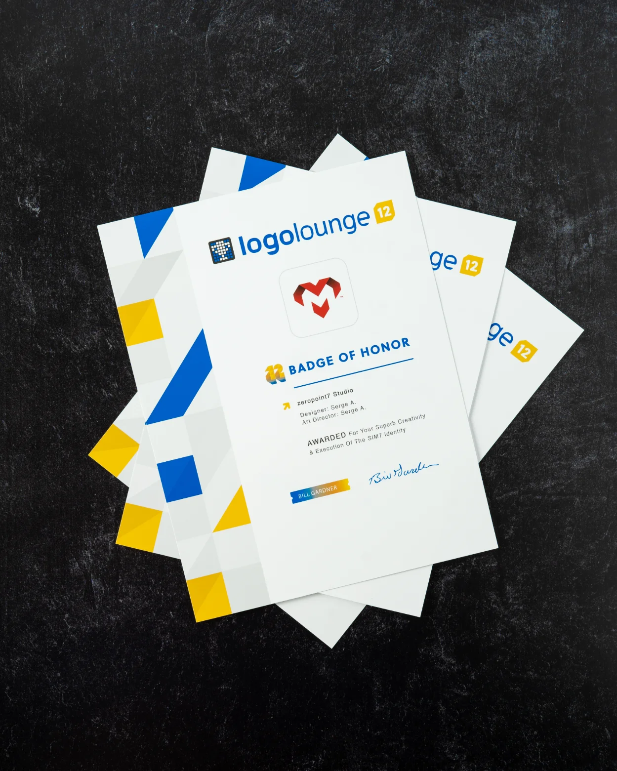
Letter M Logo Design
Designed for a client in France, this mark shows how a focused concept and precise geometry can deliver a contemporary, extremely memorable symbol. The logo is constructed around a stylized heart form with a letter M revealed in the negative space. The heart shape conveys care and connection, while the embedded letter M anchors the mark to the brand name without resorting to literal illustration.
From a conceptual standpoint, the design relies on a strategic combination of novelty and familiarity, introducing a distinctive visual idea while anchoring it in forms and structures that feel immediately intuitive to the viewer. The balance between solid shape and negative space creates tension and energy without sacrificing legibility. For brands, this kind of visual solution works well when they need a memorable symbol that can live on packaging, signage, digital interfaces, and social avatars while still appearing distinctive and controlled.
Vault Fund Logo Mark
Vault Fund is a fund of funds manager focused on leading global venture studios and formation funds, with a strong emphasis on technology driven investments. This logo mark needed to convey security, access to opportunity, and a structured, analytical mindset. The resulting symbol pairs well considered geometry with a sense of motion and depth, supporting the idea of a modern financial platform that is both stable and forward looking.
Alongside the symbol, I developed a custom word mark that complements the logo’s visual language. The typography has been tailored to match the logo’s angles, proportions, and rhythm, which avoids the disjointed feeling that often appears when a stock typeface is dropped next to a custom symbol. For an investment brand, this level of integration is important. It signals discipline, attention to detail, and a cohesive identity that investors and partners can trust.
2 Step Reviews Logo & App Icon
2 Step Reviews is a SaaS platform and mobile application that helps businesses gather and manage online reviews by consolidating feedback into a single dashboard. The logo mark and app icon are built from a 3/4 perspective view of two ascending steps combined with a unique speech bubble form. The steps convey the two-step process of the platform, while the speech bubble clearly ties the mark to feedback and customer voice.
Because the product lives heavily in digital environments, the design had to perform inside small app icon confines, on dashboards, and across marketing touchpoints. The simplified geometry, clear silhouette, and strong internal logic of the symbol ensure that it remains legible even at very small sizes. At the same time, the mark is distinctive enough to stand apart in crowded app stores and browser tabs. This blend of clarity and character is central to how zeropoint7 Studio approaches work for SaaS and technology brands.